

How to implement a new mobile website
At a time when more than half of web traffic is via mobile devices, not having a responsive or mobile website is virtually unacceptable. A mobile website is a service that can be conveniently viewed on devices with smaller screens, like smartphones and tablets. It is this group of devices that generates the majority of web traffic.
Appropriate adjustment of your website to be displayed on mobile devices has an impact not only on user experience, but also on the visibility of your website in search engines. The lack of a mobile version, inadequate optimization of this version of the site, or mistakes when implementing this type of version of the site can negatively affect search engine visibility.
Mobile Page Types
Before we start any work, it is essential to mention the two main and most popular types of adjusting websites to display correctly on mobile devices. We distinguish between "responsive websites" and "mobile versions of websites". The result of both of these is a mobile version of the site, which displays correctly on smartphones and has similar functionality to the version that is presented on computers. So let's take a brief look at each solution.
Responsive websites
The main feature of responsive websites is that they work with the same data and the same CMS as the desktop version. Practically always, such websites have the same content on all devices, which, even when not displayed, is in the source code of the website and available at the same URL. It is a relatively safe solution in terms of SEO and, above all, convenient during service management. The exception here are responsive websites that serve dynamic content – we won't go into the details of this solution though.
The main idea of responsive websites is flexibility, i.e. using one CSM system to manage content and presenting different content layouts depending on the resolution on which they are displayed.
Advantages of responsive websites
We can say that a responsive website is built from many blocks, which, depending on the current resolution, are displayed in the appropriate form, position and order. It also happens that in a given resolution some elements are hidden, while others are displayed. Nevertheless, we still work on one system and one content. Thanks to this type of solution, one and the same block can be visible on computers and tablets and at the same time hidden on devices with small screens, such as. smartphones. This block, although invisible for the user, is located in the code of the website, so it is still available for search engine robots.
In the end, most often we get virtually the same view of the page on both computers and mobile devices, and moreover under the same URL:
Computer version: http://gomobi.en

responsive version: http://gomobi.pl
This is one of the most popular methods of building mobile-friendly websites and is recommended by Google – however, it also has its drawbacks.
First of all, despite the fact that the end user is presented with the content designed for his device's resolution, the browser usually has to download and render all the other elements, often unnecessary in this resolution, as well. I mean here m.in. page blocks, which are presented only in other (e.g. higher) resolutions and all kinds of scripts and photos, which are not currently used and displayed in a given resolution. As you can guess, downloading all these unnecessary elements has a negative impact on site loading time and its weight. The exceptions here are the aforementioned responsive websites, which serve content dynamically – their implementation, in turn, is much more problematic. Responsive versions of websites require testing in terms of operation and display on multiple devices – due to their scaling due to resolution, they require physical testing on many specific devices.
Mobile websites
Mobile websites are versions of the website that are also dedicated to mobile devices such as smartphones and tablets. However, this type of solution differs significantly from responsive websites. Websites of this type are most often placed in subdomains like: www.m.domain.pl. Sometimes it happens that they are also located in directories like www.domain.pl/mobile/, or even on separate domains.
Mobile websites are websites that are built from scratch, very often on a separate template with only mobile devices in mind. Templates are built and optimized for a particular resolution of mobile devices such as. smartphones. In the case of this technology we have 2 different URLs for each of the subpages of a given website. Thus, the home page of the service, is available at the default URL, such as.: http://www.newspaper.pl/, where it looks standard:

Computer version: http://www.newspaper.pl/
And besides, it has a service dedicated to mobile devices, under an additional URL, usually in a subdomain: http://www.m.newspaper.pl/ – so called. mobile version. The versions in the subdomain are displayed to users with devices of a specific resolution (e.g. smartphone users). The mobile version of the site in the subdomain, when visited on a mobile device looks as follows:

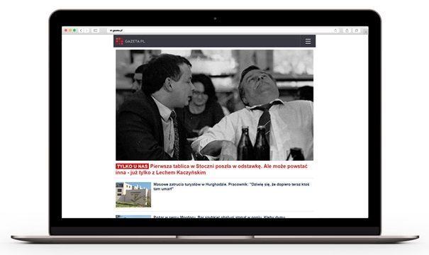
Mobile version in a subdomain when viewed from a smartphone: http://www.m.gazeta.pl/
At first glance, the site looks completely as if it is a site built on responsiveness. However, if we visit a site dedicated to mobile devices (www.m.newspaper.pl) from a computer (with a properly crafted user-agent), we can see what the actual version of the site looks like:
Mobile version in subdomain in computer view: http://www.m.gazeta.en/
Significant difference in website design can be seen in the computer version of the https://www website.totolotek.pl/:

Computer version: https://totolotek.pl/
and its mobile version in the subdomain from the computer view: https://m.totolotek.pl/
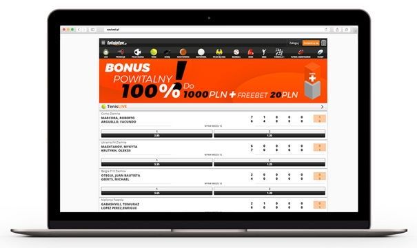
Mobile version when viewed from a computer: https://totolotek.pl/
In both of these cases, you can see specific differences in how the site is built and how it is displayed, depending on the version you visit. At first glance mobile websites look much simpler and lighter.
As far as the advantages of creating mobile websites in subdomains and applying this type of solution are concerned, we certainly have here a significant jump in the speed of loading this type of website. Moreover, the created version is dedicated to mobile devices and optimised for them. Therefore, this type of service is fully adapted to devices with small screens and tested only for them. There is no need to test the website on many different devices.
All this influences the fact that creating a mobile version is often cheaper than implementing responsiveness, which requires testing for multiple devices. Additionally, a website dedicated to mobile devices is usually very light and fast, and loads only what is necessary for users.
Unfortunately the main disadvantage of this type of solution is usually problematic management of pages and their content. Very often, modifying the content of a page in a subdomain is done through a separate panel. Because of this, sometimes if you want to put a given type of content in both versions, you have to do it twice. Implementation of this type of solution also requires proper marking of particular URL versions, so that search engine robot could easily relate them with each other. Because of this, most people nevertheless decide to invest in responsiveness or simply rely on mobile applications.
Dangers of mobile version
One of the most serious threats when implementing a mobile website on a dedicated URL (not responsive) is that it will not contain all the content and text that is available on a desktop website, including e.g. internal links. Due to the fact that websites of this type are usually supposed to be very simple, their owners often decide on e.g. completely remove category description blocks or resign from creating some subpages. The result is the presence of the description block in the desktop version, and its absence in the mobile version. Or the presence of a blog in the desktop version, and its absence on the mobile.
Implementing a mobile version on dedicated URLs is also associated with the need to implement appropriate labeling of individual URLs and versions of the subpages. This is a very important technical issue, which unfortunately is very often overlooked. The above-mentioned problems may lead to a drop in the position of phrases and visibility of the website for selected keywords.
Google search engine robot, in accordance with the "mobile first index" rules, downloads all pages as mobile robot. Therefore, in the case of implementation of the mobile version, its priority will be to download it. Additionally, implementation of the mobile version involves automatic redirection of mobile users (and thus mobile robots) to the mobile version. This means that Google's robot will be – as well as mobile users – automatically redirected to this type of version. What's more, if the robot is not redirected but manages to find this type of version and finds out that it is a mobile version, it will also start indexing only this version.
In this particular case, which concerns a large number of websites based on this technology, we are dealing with one serious problem. A mobile robot simply will not see and rank content that is not in the mobile version, but only in the desktop one. In even worse case, it may consider some version as a duplicate and even remove it from the index.
So we can very quickly fall back on given keywords, on which we have bumped e.g. thanks to category descriptions, internal linking, or any other SEO elements which were present in the desktop version and are now absent in the mobile version. To avoid this type of situation, it is necessary to properly mark the equivalents of simplified versions of subpages in the subdomain and their equivalents in the desktop version.
How to properly implement a mobile version of a website?
To prevent loss of visibility and any drop in search engine traffic, it is necessary to plan the migration properly and include all the necessary SEO elements.
1. Appropriate structure of the mobile version of the service
First of all, remember that by launching a mobile site, it will be indexed by Google's mobile robot. Therefore, while creating this type of website, the structure of existing subpages in the desktop version should be ideally mapped. This means that if in the computer version the website contains the following structure: home page, 10 category subpages, 50 product subpages, 3 static subpages, 20 blog entries, an identical website structure should also be created on the mobile version of the website, which will be launched for example. in subdomain. It may have a different layout, of course, but the idea here is that these subpages simply exist.
It is unacceptable that in the mobile version there will not be many of the subpages of the website, which are available in its desktop counterpart. Mimicking the structure of the main website is very important, as it will directly affect the traffic on the site.
Let me explain with an example. Let's assume that we are on the 2nd position in Google for the phrase "Which coffee to choose". For this keyword, we show up with the address of the blog post: "www.store.pl/blog/jaka-kawe-wybrac". During the planning of the mobile version of the site, someone decided to completely omit the blog, because they believe that it is completely unnecessary in this version. At this point, it is very likely that there will be a situation where you will lose visibility for this particular keyword. Additionally, we will most likely lose visibility for all other keywords which were assigned to a particular entry, as well as many words such as. from the long tail. This is quite logical – if there is no subpage, there will be no visibility associated with it. Nevertheless, it often happens that the owners of the website, wanting to simplify the mobile version of the website too much, decide to do exactly this kind of steps.
2. Proper marking of mobile and desktop versions
In the first point I mentioned the necessity of mapping the mobile version website structure to the desktop one. This is the first and basic step of creating a new website or migrating to its mobile version. It is also necessary to make the appropriate technical changes.
If the website already has a separate mobile version, which is available at m.domain.pl, it is necessary to properly mark both of these sites, and in fact each of their URLs.
Google requires us to somehow link the URL in the mobile version, to the URL in the desktop version and vice versa. Appropriate tagging, which serves to link the two versions of a given subpage, helps the search engine find the content and its addresses and understand the relationship between the subpages in the desktop and mobile versions. Thanks to this the algorithm is able to treat them appropriately and, in a way, combine the signals of both URLs of the same page. In practice it means that if the mobile version does not have e.g. A 1000-character description of a category, which can be found in the computer version, means that if the appropriate links between pages are missing, we will probably lose the visibility and traffic that this description generated.
When the mobile version lacks the selected page, it is possible that Google will limit the visibility for the phrases which were assigned to it. In the case when appropriate markings for both versions of the URL appear in the structure of sites, Google will recalculate the page rating accordingly and treat both URLs as a single page. For this to happen, however, it is necessary to implement the rel="alternate" tag in the computer version and the canonical tag in the mobile version of the site:
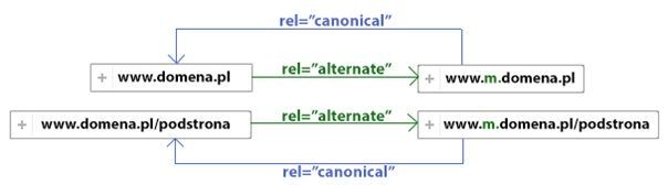
Schema of tagging implementations
2.1. Tag rel="alternate" in the computer version
The rel="alternate" tag is supposed to indicate an alternative version of the given URL. This tag should be placed on every subpage of the desktop (computer) version. It is used to indicate to search engine robots the alternative version of a given URL and the type of device it is directed to, in this case the mobile version URL in the subdomain.
For the sake of the example, let's assume that we have 2 addresses in the desktop version: http://www.domain.pl/ and http://www.domain.pl/kawa-rozpuszczalna/ and 2 addresses for mobile devices: http://www.m.domain.pl/ and http://www.m.domain.en/kawa-soluble/.
Therefore, the main page of the website (http://www.domain.pl/) should contain additional code in section <head>, which will indicate an alternative address for this page. So the URL of the alternative version for mobile devices:
Subpage address (http://www.domain.pl/coffee-soluble/) should also contain the appropriate code, but it should obviously point to the URL of the alternative mobile version of this particular subpage:
Explanation of code elements
rel=”alternate” – is responsible for specifying that this is an alternative URL
media=”only screen and (max-width: 640px)” – is responsible for defining that the given alternative address is dedicated to mobile devices
href=”http://www.m.domain.pl/kawa-rozpuszczalna/” – indicates a specific URL in the subdomain
At this moment, the 2 URLs in the computer version have the appropriate markings of their alternative versions for mobile devices.
2.2. Tag rel="canonical" in mobile version
The canonical tag is responsible for indicating the correct version of a given subpage – in our case the computer version. This tag should be placed on the mobile version of the URL of a given subpage. Thanks to the implementation of the canonical tag in the mobile version, we will create a bi-directional marking, which will clearly and explicitly mark and link both URLs. Thanks to this, search engine robots will have no problems with understanding and downloading the page. However, for this to happen, it is necessary to implement the canonical tags. For the purpose of the example from point 2.1. we assumed that we have 2 addresses in the computer version: http://www.domain.pl/, http://www.domain.pl/kawa-rozpuszczalna/ and 2 addresses in the version for mobile devices: http://www.m.domain.pl/, http://www.m.domain.en/kawa-soluble/.
We have already set up alternative tags in the computer version, so we need to implement canonical tags in the mobile version. Therefore the main page of the mobile version website (http://www.m.domain.pl/) should contain additional code in the section <head>. This is the canonical tag code that will point to the computer URL (the standard one):
Subpage address (http://www.domain.pl/kawa-soluble/) should also contain the appropriate canonical tag. It is obviously supposed to indicate the URL of the alternative version of a given subpage for mobile devices:
Summary
Thanks to additional tags in the section <head> if you make the computer address rel="alternate" and the mobile address rel="canonical", search engine robots can get clear information about the relation between two versions of each subpage. This will allow correct analysis of the domain content and smooth movement of robots between different versions of the same subpage. Marking of alternative and canonical pages should be implemented simultaneously on the whole website – on all its subpages.
As you can see, using a dedicated mobile version requires not only its creation, but also a small, additional configuration of tags in the <head> both versions of the service. Although a dedicated mobile version gives a lot of possibilities in terms of its optimization, due to the small difference most companies decide to implement responsiveness, which is primarily easier to manage.