What we need to remember when designing a website, which everyone will be able to use easily and quickly
Will 2020 be a revolution for the web design field, or maybe we’re in for an evolution of the temporary trends we’ve seen in the past year? What we should remember about, and what is only an option – about this you will learn from the following article.
Thumbs up for thumb-friendly!
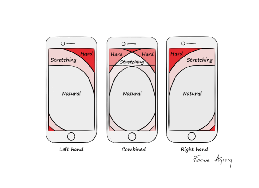
It is estimated that over ½ of global internet traffic comes from mobile devices. In 2020, we expect an ever-increasing consumption of online information via smartphones. These devices have not only caused a change in our lifestyles, but also in the way we interact and search for information. As a result, the most important web design trend of the year will be thumb-friendly. This will make navigating a website as instinctive and easy as mobile apps. Paying attention to thumb-friendly designers will need to keep in mind:
– use of legible and easy to read fonts
– large headlines and proper spacing to make reading easier
– maximum simplicity and shortening of the path of the user navigating the website
– appropriately placed buttons within reach of our thumb

Time is the key to gaining user’s attention
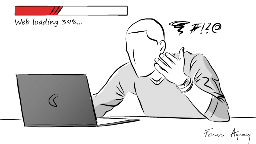
Google Lighthouse, built into the browser, causes a widespread obsession with the speed of loading websites.
“More than half of users expect the page load time to be at most two seconds. Longer waiting time increases the chances of leaving the site.”
This suggests that 2020 will be a year of relentless optimization.
Customers demand faster and faster responses
The basis of communication with the customer is a very dynamic contact. This is facilitated by numerous plugins and applications that can be installed on a website. Call Page or Messenger Widget is a “must have” for every modern website. But there are many more possibilities. If you still haven’t implemented them on your site, it’s worth thinking about why?
– because it increases the number of incoming requests
– greatly shortens the contact path for users
– speeds up customer service
– helps to close the sale faster
Vibrant and bold colors are on the rise again
Last year, we often suggested clients use bright and bold colors in their brand identity. Designed in such a way, the websites aroused emotions and met with positive acceptance. By using expressive shades we can focus on generating emotions of the audience, creating positive associations and moods. The year 2020 will be much more colorful for designers than the last one. To choose the right composition, color psychology will help us.
Interactions will stimulate your audience
To increase the attractiveness of the website we recommend creating animations. Moving buttons or icons that animate only after scrolling the screen, making it easier for the recipient to focus on a given element on the page. The upward trend will be preserved if video is featured on the website, which is still popular.
Virtual walk is a form of promotion which is still underestimated. It is mainly associated with the presentation of residential or office investments by the developer. At the same time it can be used successfully in marketing strategy or service activities e.g. as part of an interactive website. Such an action will definitely increase sales opportunities, and at the same time will positively affect our image and increase the sense of modernity in contact with the website.
The success of the video format in product presentation is not diminishing, and in 2020 we must be prepared for a real increase in this trend. Where to get inspiration from? Let’s look for them in what our users like the most, e.g. in fashionable “stories”, i.e. short reports posted on Instagram or Facebook.
3D solutions work very well in the housing market. An interactive building block implemented on our website will make it easier and faster for the user to find the property they are interested in. What’s more, it will make you realize and imagine your specific investment. It’s already halfway to contacting the developer…
Creating websites in 2020 will bring not only a revolution but also an evolution of current trends. Do not forget that each idea should be adjusted to the client and his/her needs or business profile, following first of all the expectations of the target group.
Keep in mind the emotions that the project evokes. This year, they will lead designers in the right direction.
In summary
1. Remember that most people use a smartphone when searching for information on the Internet. Therefore, the website should be designed with mobile device users in mind first.
2. An important trend is thumb-friendly – everything that is designed for mobile devices should be easily and quickly operated by our thumbs as they are the extension of our movements on the website.
3. Pay attention to the volume of your page – loading time is the most important. Do not overload the page with unnecessary elements that will slow it down.
4. The interface itself is not so important. Remember the experience. Introducing simple interactions will allow us to direct the user by. a pre-planned path. Then, we will decide when the user should focus on the text, when on the photo, and when they should read the contact details or the inquiry form.
5. A website is your office on the web. Don’t let it talk bad about you.
Focus Agency is a marketing agency which for years has been providing clients with integrated solutions in the field of strategy and promotion of brands and individual products, generating an increase in conversion and sales. Many years of experience in the shopping mall, real estate and agriculture industries has allowed to develop marketing solutions that guarantee customers, full satisfaction with the services provided and return on investment. Focus Agency core competencies are: communication strategy, corporate design and branding, media, brand activation, social media, PR and media monitoring.
